Home Work Webpage Designs
Web Design Marketing Pages Responsive 2022 – 2024

Webpage —
A small collection
of marketing surfaces

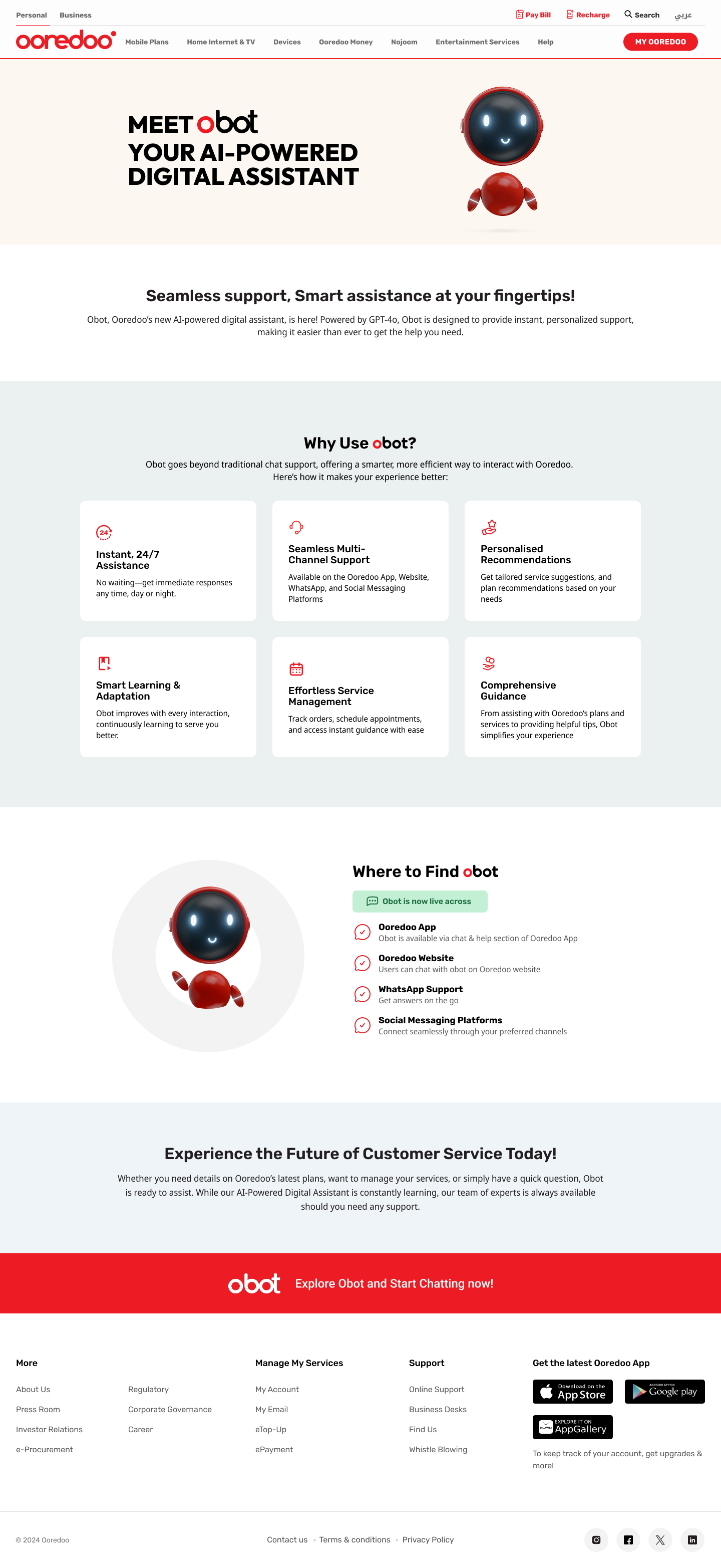
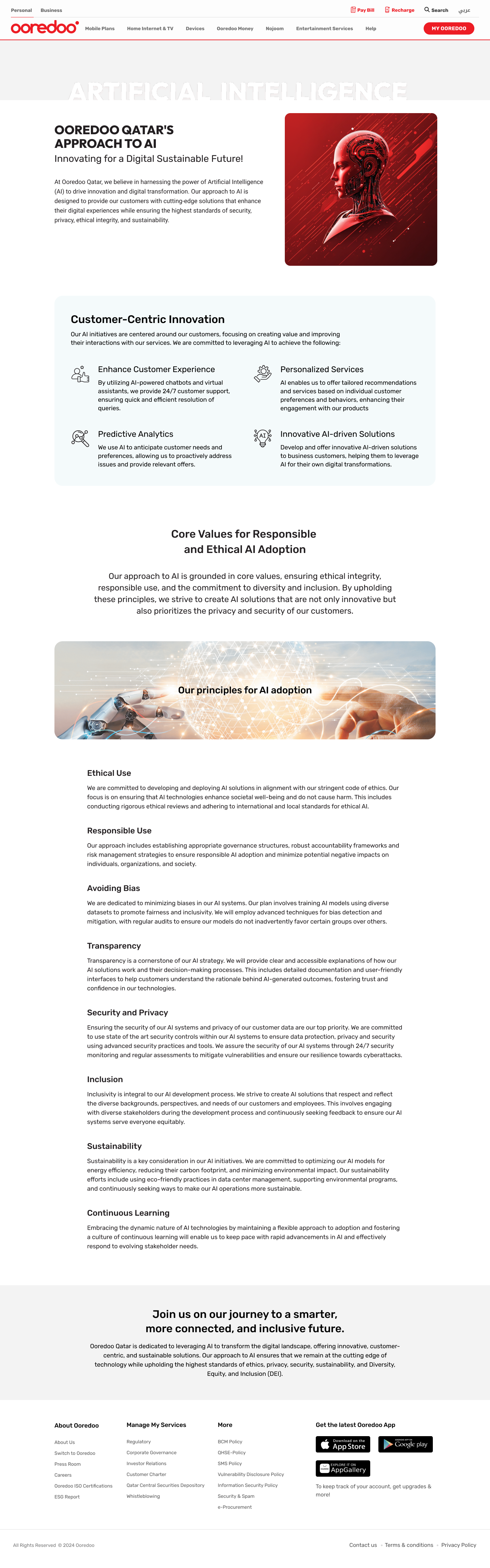
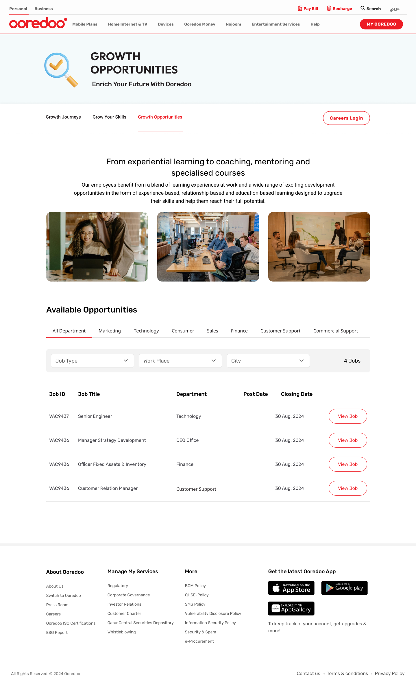
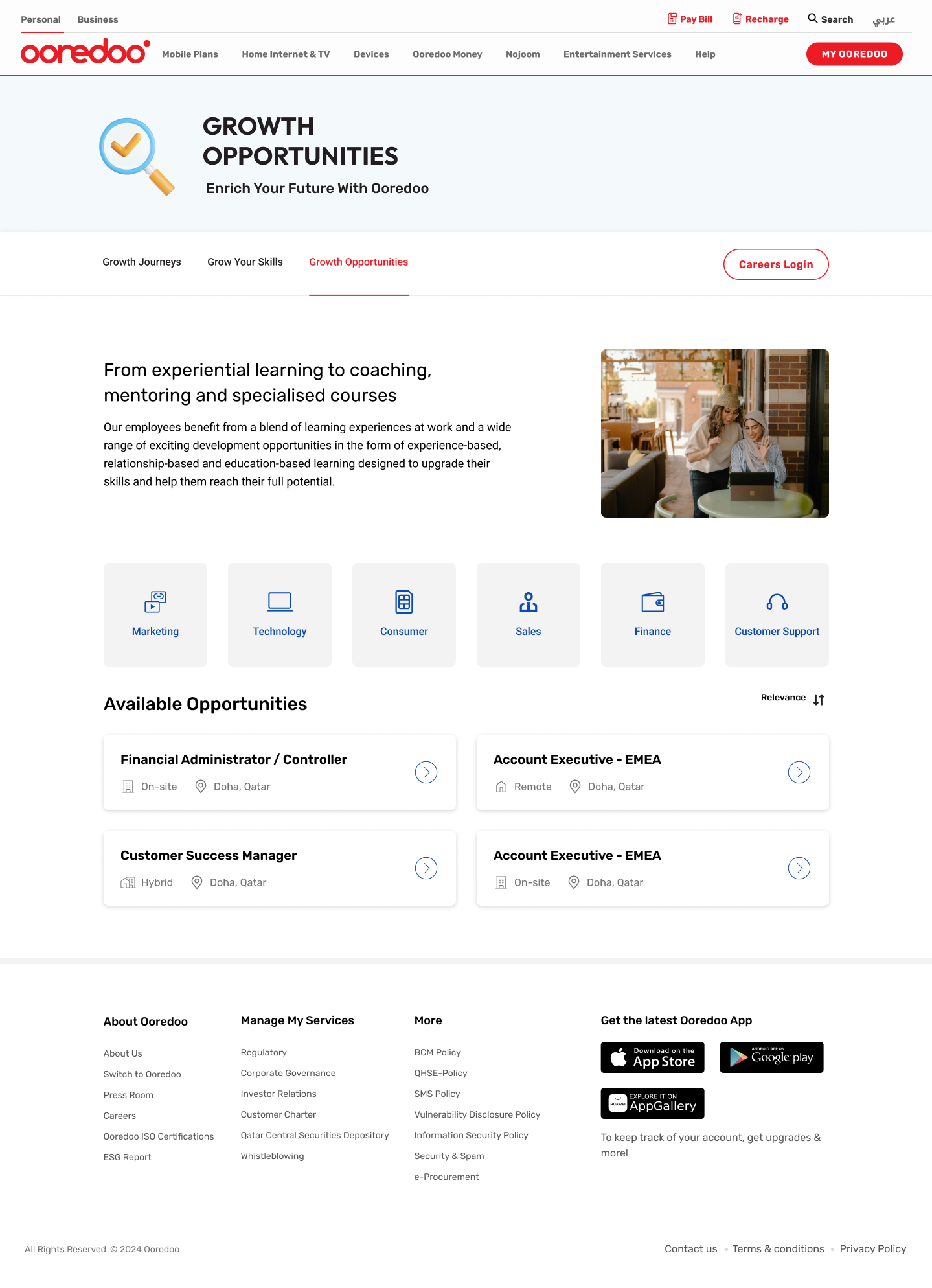
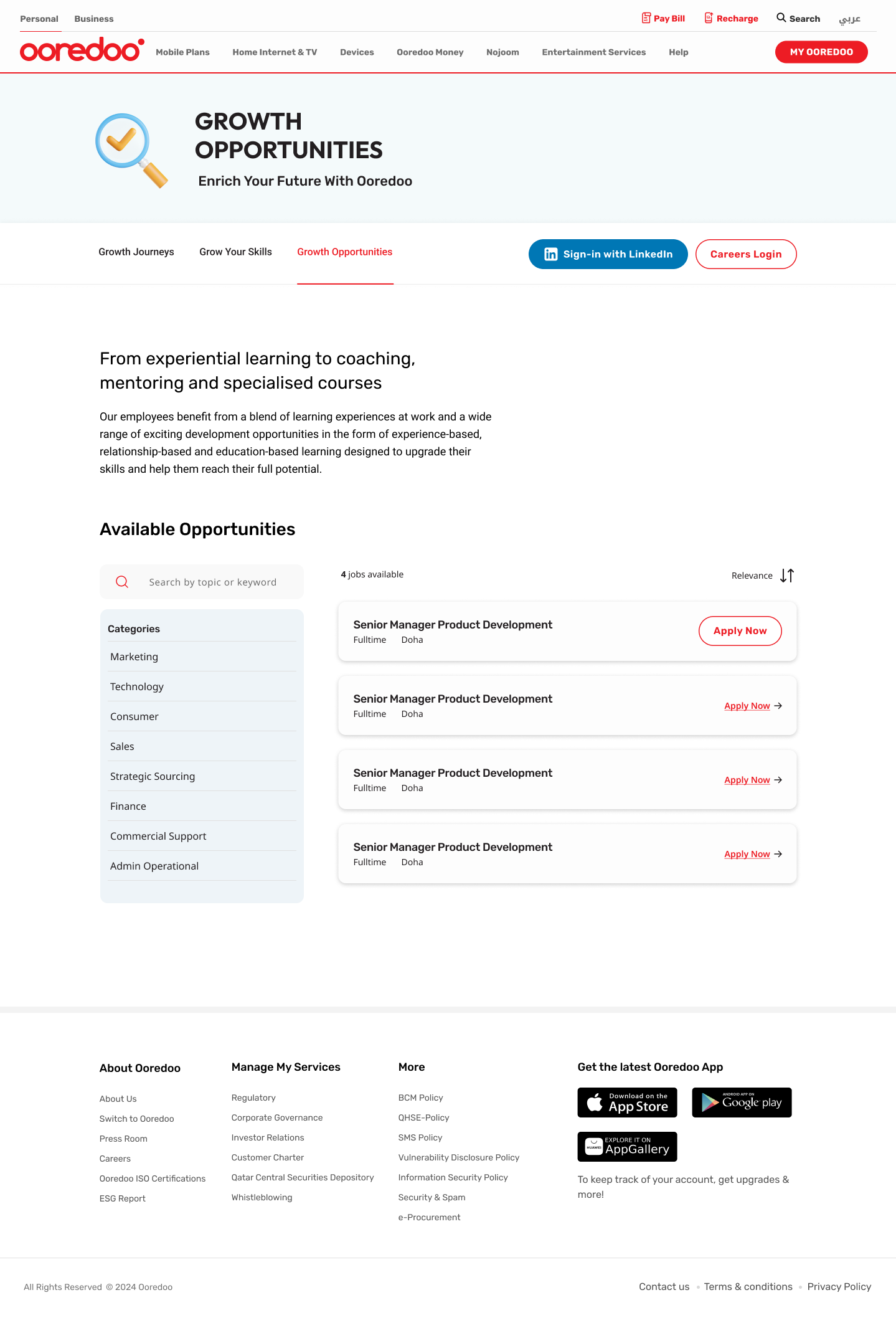
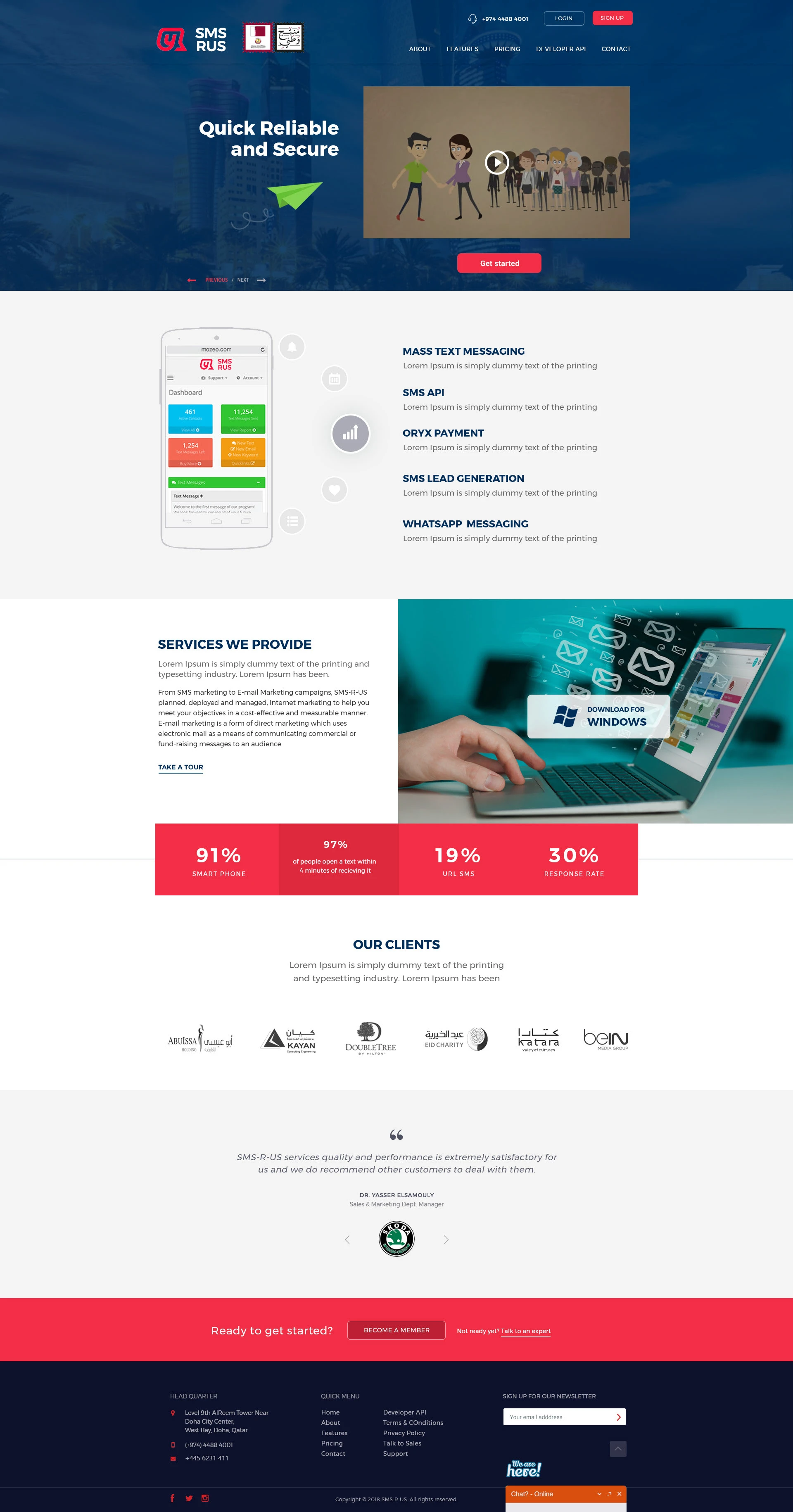
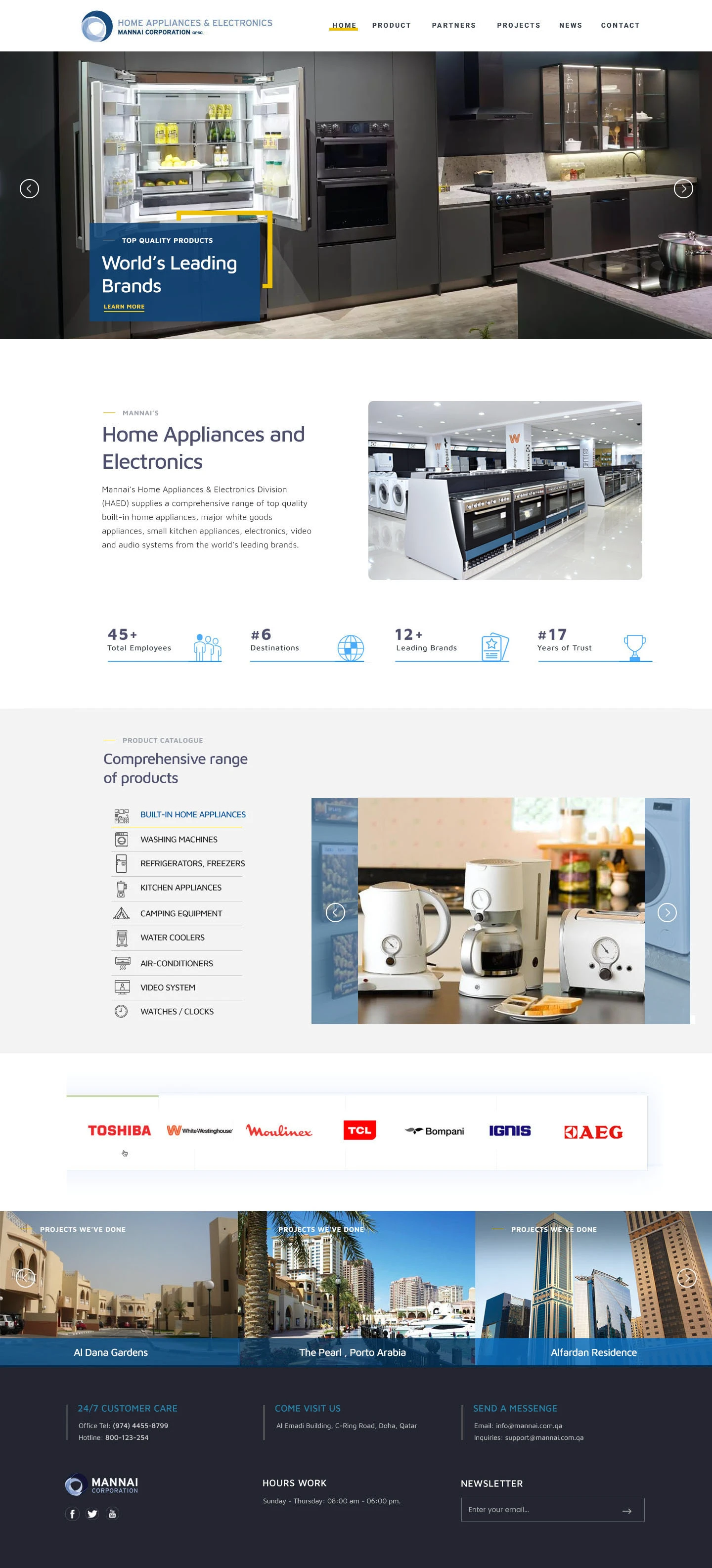
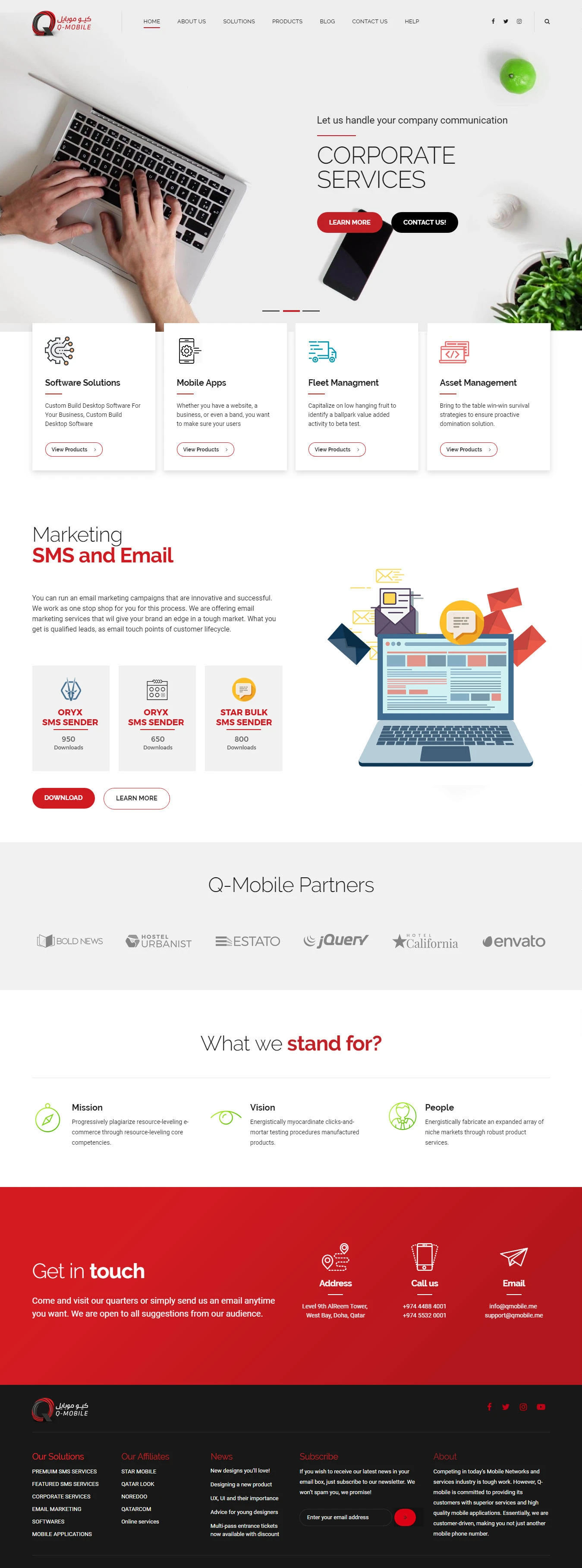
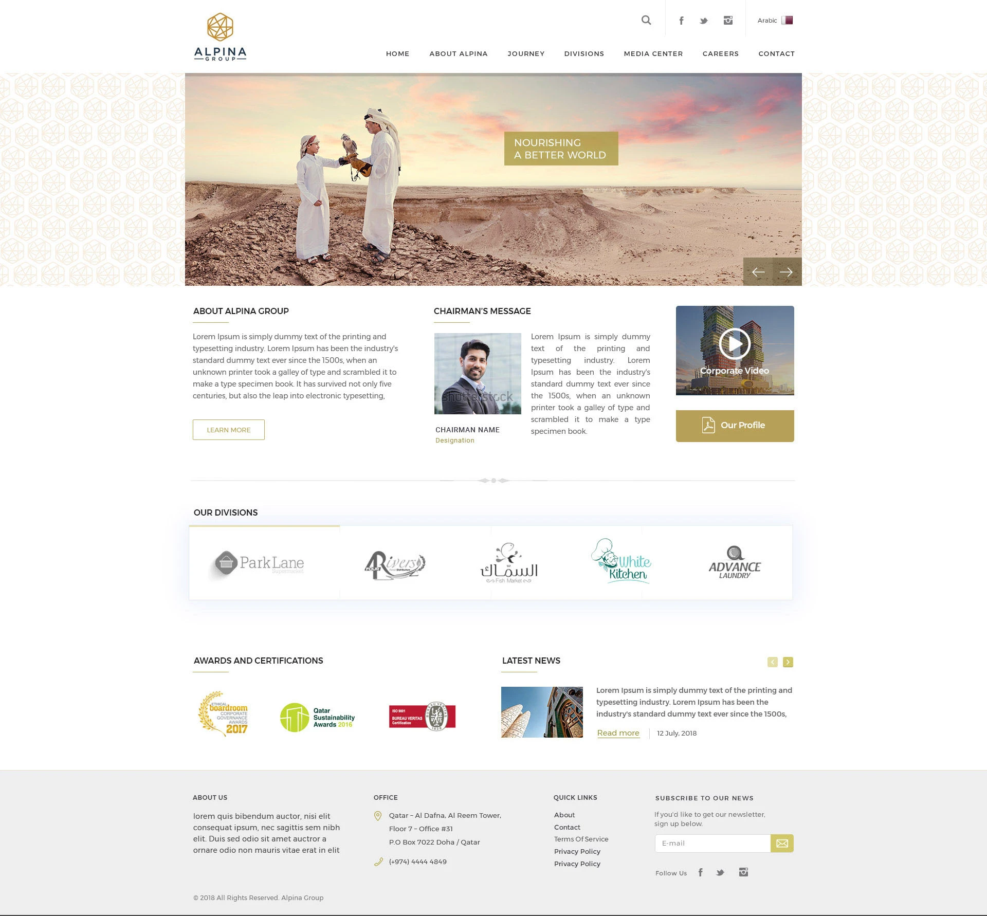
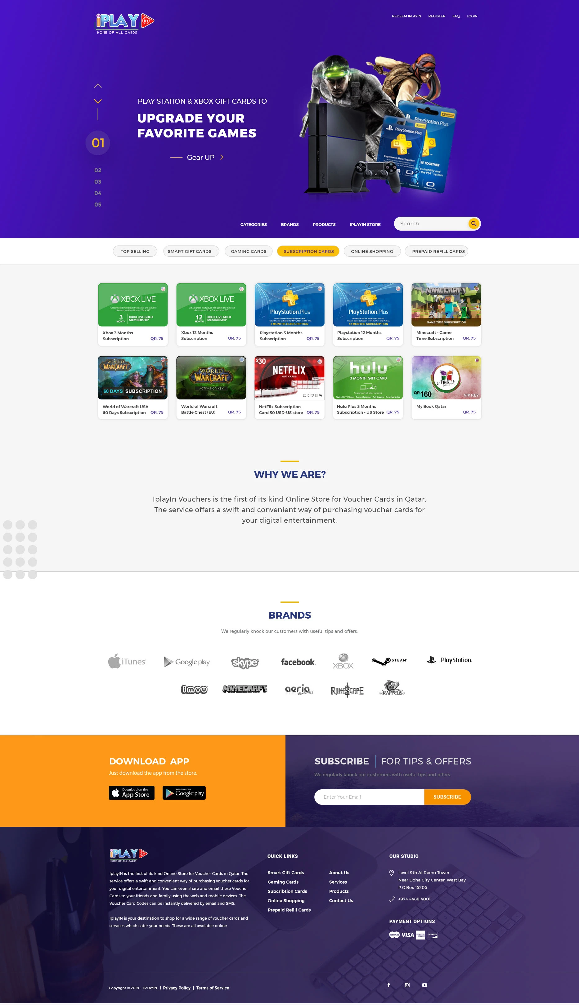
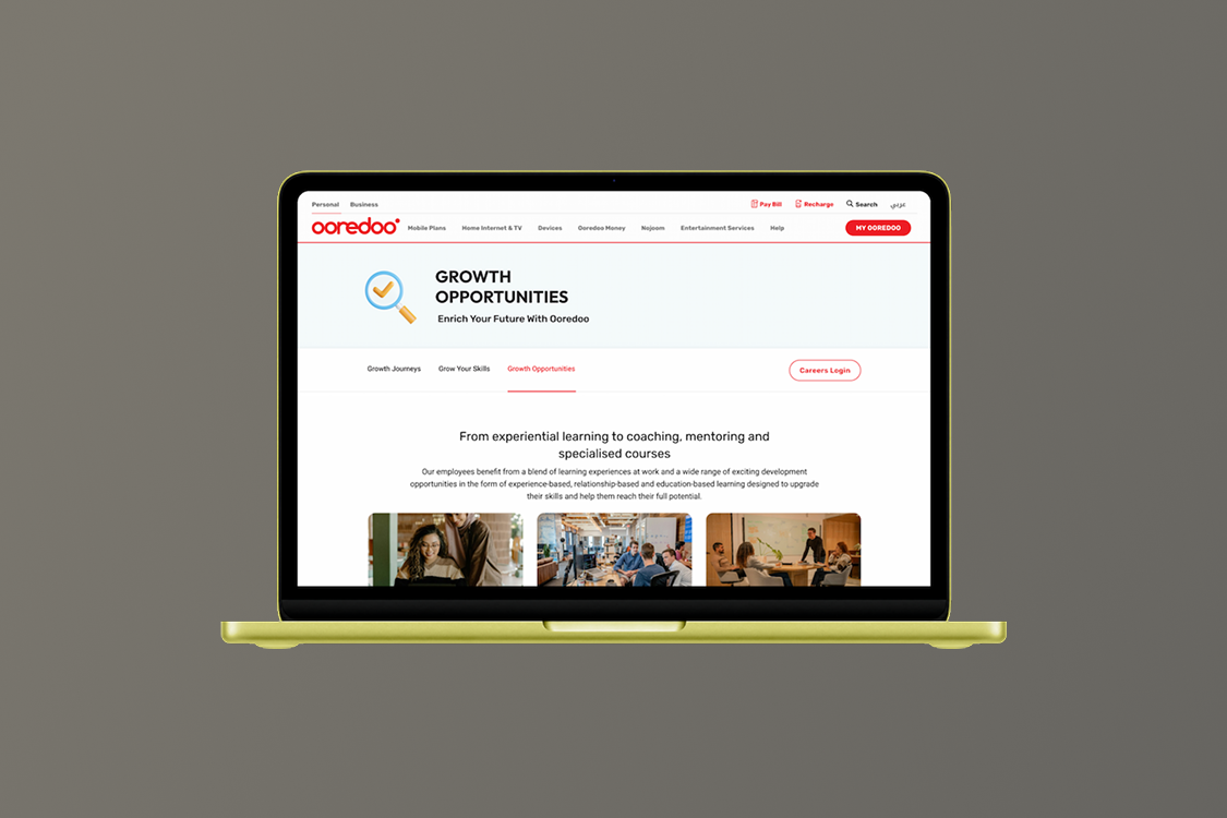
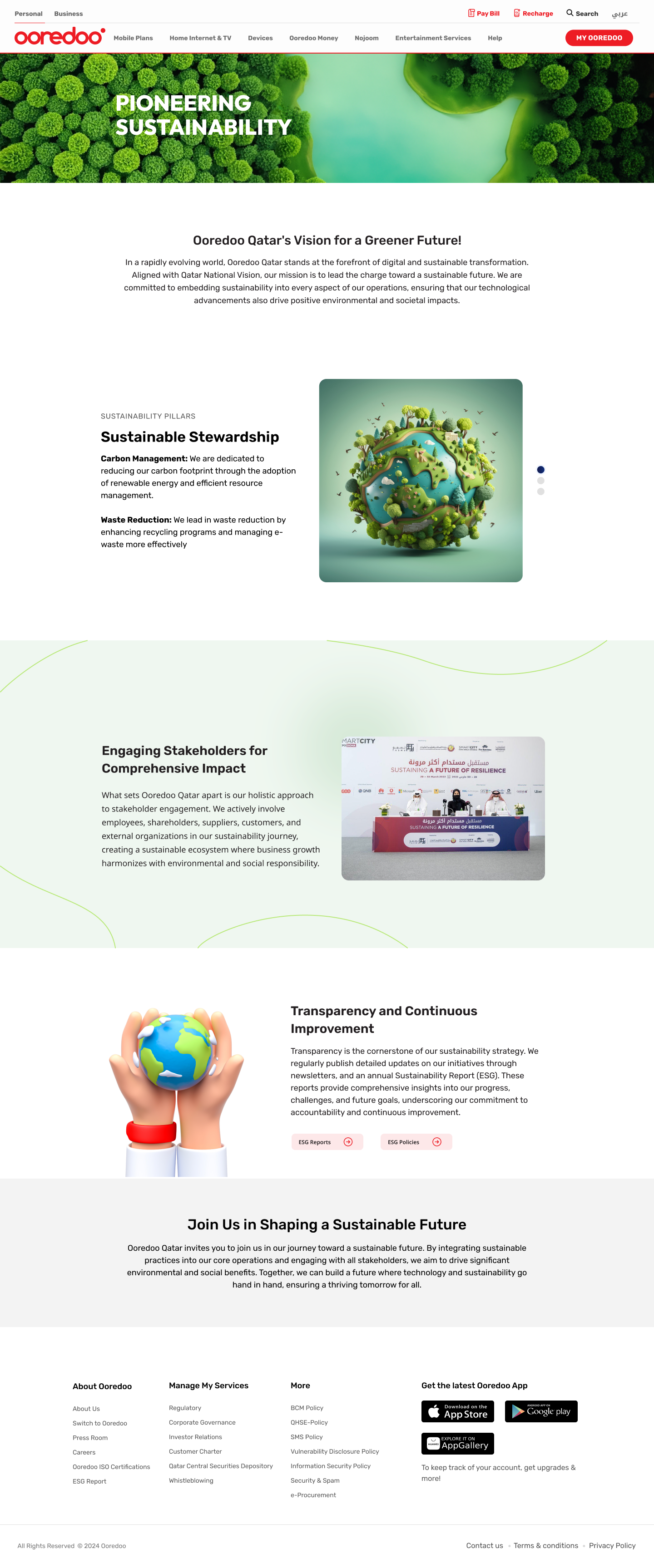
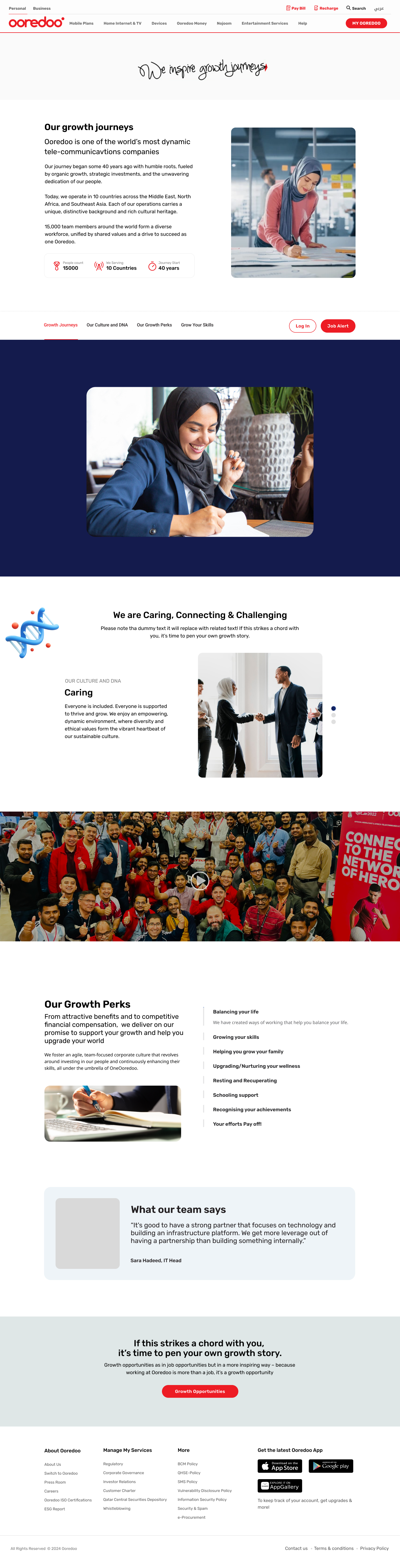
A selection of webpage designs — landing, marketing, content, and detail pages — designed to feel related to each other while serving different jobs. Click any thumbnail to open a fullscreen preview.

My Role
UX/UI & Web Designer
Scope
Marketing & content pages
Timeline
Various · 2022 – 2024
Platform
Responsive web
Contributions
UI · Layout · Design system · Handoff
Tools
Figma · FigJam
Webpage designs — hero
01 — The Challenge

Pages that do their job without all looking the same

Marketing surfaces live a strange double life. Each page has a different job — the home page sells the proposition, the services page educates, the contact page converts — but together they have to read as a single coherent brand. Lean too far toward sameness and the pages become forgettable. Lean too far toward variety and the brand falls apart.

The goal across this collection was to build a small visual system flexible enough to give each page its own rhythm, while leaving no doubt that the pages belong together.

"Every page should feel like the same band playing a different song."

01
One System, Many Purposes
Marketing, content and conversion pages all share the same components but need very different content rhythms.
02
Responsive From the Start
Every page had to work on mobile, tablet and desktop — not as a media-query afterthought but as a design intent.
03
Editorial-Quality Typography
Long-form pages demanded a type system that handled headings, body, captions and pull-quotes gracefully.
04
Performance-Aware
Layouts were drawn with image-weight, font-loading and CLS in mind — design decisions that hold up after engineering ships.
02 — Strategy

A shared kit of parts, composed differently per page

Every page in the collection is composed from the same kit — a hero, a value-prop block, a feature grid, a quote, a CTA band, a footer. What changes is the order, the rhythm, and the editorial choices inside each block.
8
Page Templates
24+
Block Components
3
Breakpoints
1
Token Set
01
Define Tokens First
Colour, type, spacing, radius and shadow tokens locked down before any page composition.
02
Block Library
A small library of page blocks — hero, feature grid, testimonial, CTA, footer — each with variants for content density.
03
Compose, Don't Redraw
Every page in the collection is a composition of blocks. New pages take hours, not days, because the parts already exist.
04
Mobile-first Rhythm
Each block was designed at 375px first, then scaled up. Desktop is the reward, not the starting point.
05
Specs Tied to Tokens
Handoff annotations reference tokens by name, so engineering builds against semantic values not absolute pixels.
04 — The Result

A coherent web
presence, not a stack of pages

The collection reads as one brand across every page type — from a quick contact form to a long-form article.

8
Page Templates
Eight distinct page templates composed from a shared block library.
24+
Reusable Blocks
Heroes, feature grids, testimonials, CTAs — each as a variant-driven component.
100%
Responsive
Every layout designed mobile-first and validated at tablet and desktop.
Faster New Pages
New marketing pages now take roughly a third of the time to design.
Visual Consistency Across Surfaces
Pages share the same type rhythm, colour treatment, and spacing logic — they look like a family by construction.
Faster Marketing Velocity
Spinning up a new campaign page is now a composition exercise, not a redesign.
Built for Performance
Layouts are drawn with image budgets, font loading and CLS already in mind.
Clean Engineering Handoff
Specs reference tokens, not pixels — engineering builds against semantic values that don't drift.
05 — Reflection

What this collection
taught me

Webpage design is a craft of restraint. The temptation to invent something new on every page is huge — and almost always wrong. A small set of opinionated blocks, composed thoughtfully, outperforms a sprawl of bespoke pages every time.

The other thing this collection reinforced: typography is the foundation. Get the type scale right and most other choices fall into place. Get it wrong and no amount of imagery or motion will save the page.

  • Build a block library before drawing pages. The first page takes longer; everything after is faster.
  • Design every page on a phone first. The hard editorial choices live there.
  • Treat the type scale as a system, not a decoration. Eight sizes is plenty.
  • Annotate handoff against tokens — your specs stay accurate even when sizes change.
"

New campaign pages used to take a week. Now we ship them in a day."

Marketing Lead
Client project
Skills demonstrated
Web DesignResponsive Layout Design SystemTypography Component LibraryMobile-first Marketing PagesLong-form Content Dev Handoff
Up Next

Small Games
for Engagement

A set of six small in-app games designed to lift daily engagement and retention.