Home Work Online Booking App
Product Design Mobile App Responsive Web 2023

Online Booking —
A lifestyle app and
landing site, one system

UI design for a lifestyle booking app and its marketing landing page — built around a shared visual system that scales from a 375px phone to a 1440px desktop without losing its character.

My Role
Lead UX/UI Designer
Scope
Mobile app · Landing site · Design system
Timeline
2023
Platform
iOS · Android · Responsive web
Contributions
UX · UI · Prototype · Design system
Tools
Figma · FigJam
Hero
01 — The Challenge

One brand, two surfaces

The booking app and its marketing landing page were being designed by different teams on different schedules. The result was predictable: app and website looked like cousins at best. The brief was to bring both surfaces under a single, opinionated visual system.

"The site sells one product, the app delivers another. We need them to be the same product."

01
Mismatched Visual Languages
App and web had drifted to different colour treatments, type scales and component shapes.
02
Mobile-First, Then Desktop
Most users encountered the brand on mobile first — the desktop landing had to scale up gracefully.
03
Variety of Categories
Hospitality, food & drink, travel — the system had to flex across very different content.
04
No Shared Components
Buttons, cards, headers and form elements were redrawn for each surface.
02 — Strategy

Design the system, not the screens

A single set of tokens and a small, opinionated component library. App and web both compose from the same primitives, so they look related by construction.

3
Categories
2
Surfaces
40+
Components
1
Source of Truth
01
Audit & Token Definition
Defined a shared token set — neutral background, single warm accent, two type families, a tight spacing scale.
02
Category Templates
Three category templates, each composing the same primitives in a layout tuned to its content.
03
Landing Page — Mobile-first
Designed at 375px first, then scaled to a wider desktop layout — a different composition, not a stretched mobile.
04
Component Library
A reusable Figma library — cards, list rows, search bars, badges, CTAs — imported by both app and web.
05
Prototype & Handoff
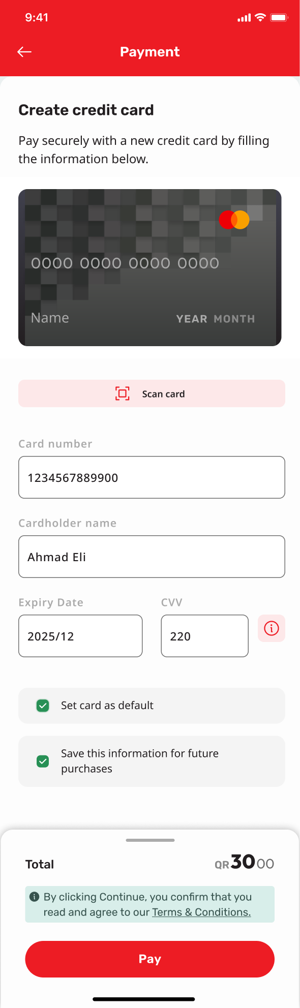
Clickable prototypes for the core booking flow, annotated specs tied directly to the token set.
03 — App Screens

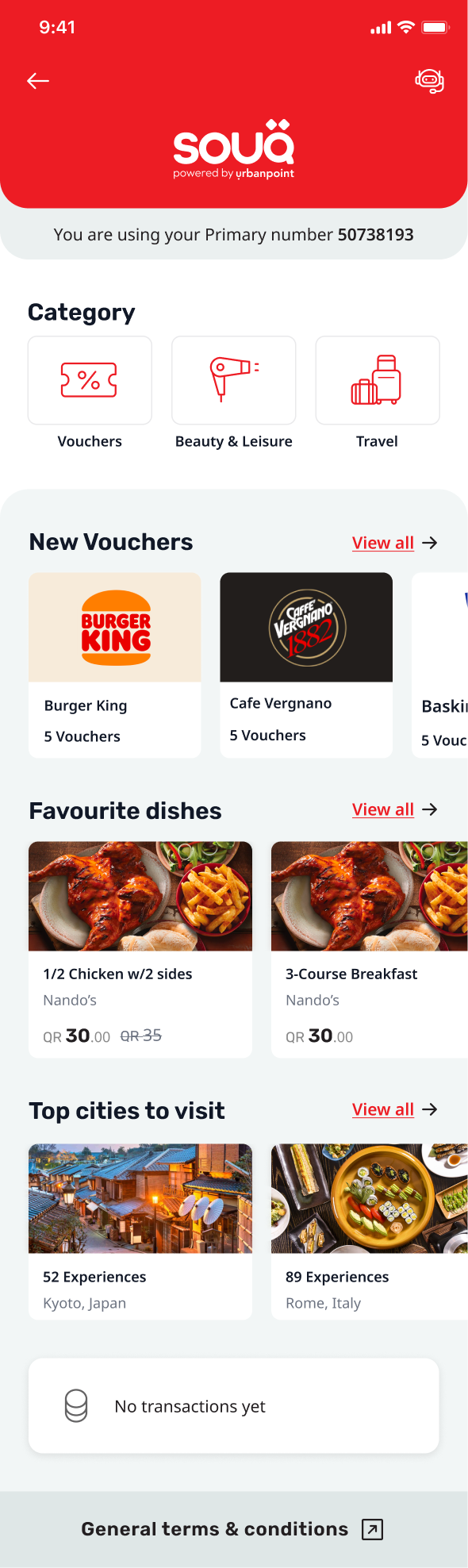
Mobile app — booking core

Drop PNG exports into assets/images/booking/ to swap the placeholders.

Home
Home & Search
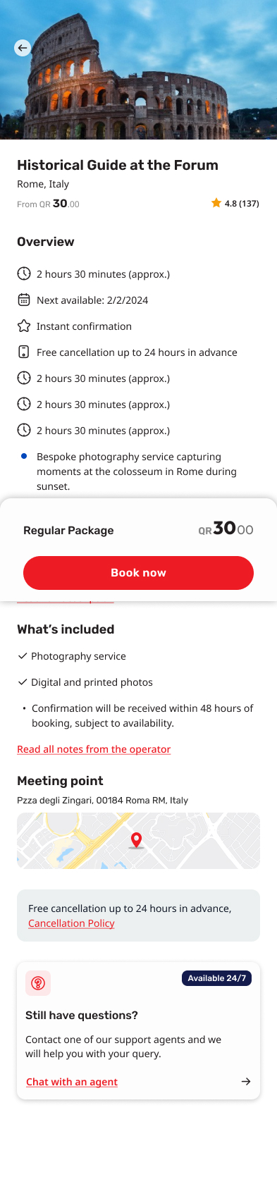
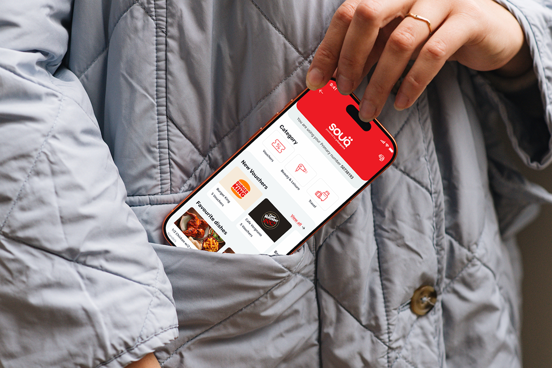
Category-first home screen
Detail
Listing Detail
Full booking detail with gallery and primary CTA
Confirmation
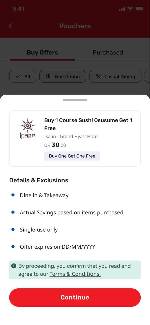
Booking Confirmation
Pattern reused across every category
Categories
Category Templates
Same system, different rhythms
Account
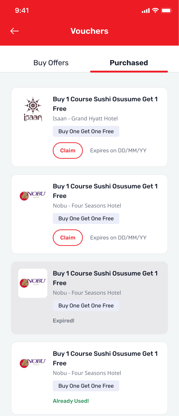
Account
Profile, bookings and settings
04 — Landing Page

One landing page, two surfaces

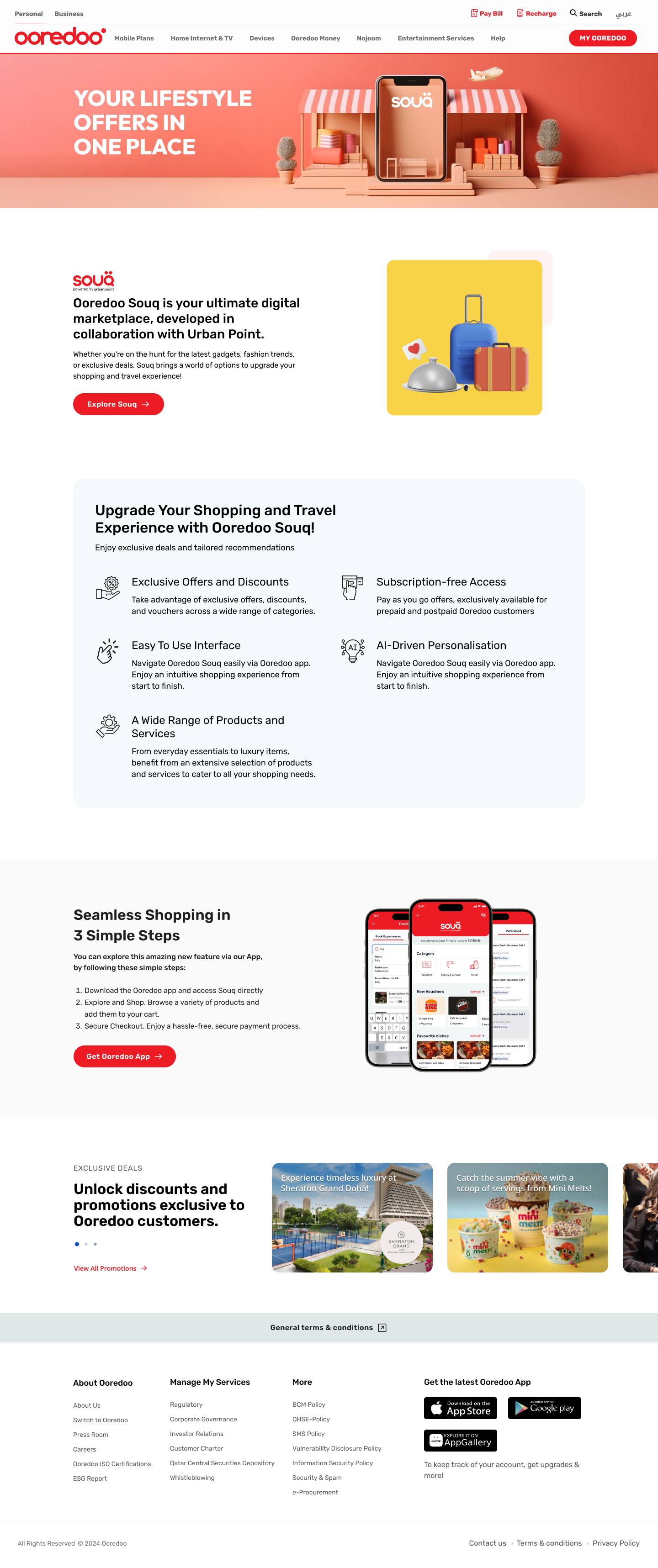
Hover the browser to scroll the desktop landing. The phone next to it auto-scrolls its mobile version on a loop — same content, layout tuned for the screen.

booking.example.com
Landing desktop
Hover to scroll
Landing mobile
Desktop landing · 1440px · full marketing layout
Mobile landing · auto-scroll · pause on hover
05 — The Result

App and site
finally feel like one product

A shared design system, a coherent journey across surfaces, and a faster path from idea to shipped screen.

1
Shared System
One token set powers both mobile app and responsive landing page.
3
Category Templates
Hospitality, food & drink and travel — same primitives.
40+
Reusable Components
Every screen composes from the shared library.
2
Surfaces, One Voice
Marketing site and product app share a visual language.
Coherent Brand
Users moving from the landing to the app see the same visual language carry through.
Faster Iteration
New flows compose from existing primitives — layout decisions, not component invention.
Mobile-First, Desktop-Tested
Works as well on a phone as on a desktop — deliberately different layouts at each size.
Clean Handoff
Token-driven specs gave engineering an unambiguous source of truth.
06 — Reflection

What this project
taught me

Cross-surface consistency is mostly an invisible craft. Users don't notice when it's right; they only notice when it's wrong. The work is in deciding which decisions belong at the system level and which need to differ between app and web.

  • Build the token set before you draw a single component.
  • Design the desktop landing as its own composition, not a stretched mobile.
  • Treat component variants like API design — fewer well-named props beats many overlapping ones.
  • Annotate handoff specs against tokens, not pixels.
"

The site and the app finally feel like the same brand. Onboarding got noticeably smoother."

Product Lead
Booking Platform
Skills demonstrated
UI DesignMobile App Responsive WebDesign System Token ArchitectureComponent Library PrototypingMobile-first Web
Up Next

Telecom Business
Admin App

A back-office redesign that consolidated six legacy tools into a single operator workspace.