Home Work Telecom Business Admin App
Product Design B2B Admin Enterprise UX 2023

Telecom Business —
An admin app that
actually runs the business

UX exploration, wireframes, and visual design for a telecom operator's internal business-admin platform — turning a sprawling set of back-office tools into a single, decision-ready workspace.

My Role
Lead UX/UI Designer
Company
iHorizons · Qatar
Timeline
~6 months · 2023
Platform
Web admin · Responsive
Contributions
Research · IA · Wireframes · UI · Prototype · Handoff
Tools
Figma · FigJam · Miro
Hero
01 — The Challenge

A back-office stitched together from too many tools

The business-admin team at a major telecom operator was running day-to-day operations across half a dozen disconnected internal apps. Operators were context-switching constantly and reconciling data by hand.

The brief was to design a single admin app that surfaced the right work at the right time, gave operators a complete view of a business customer, and made high-frequency tasks fast.

"By the time I've opened the four tabs I need to answer one ticket, the customer has already called back."

01
Fragmented Customer View
Customer data lived across provisioning, billing and CRM with no unified profile.
02
High-Volume Work
Hundreds of cases per day with no shared queue, no prioritisation cues.
03
Rigid, Form-Heavy Flows
Routine actions required deep, validation-heavy forms.
04
No Design System
Each legacy module had drifted visually — buttons, tables and modals all subtly different.
02 — Strategy

Anchor on the operator's actual day

I built the new admin app around the operator's working day — the moments they switch context, the data they need at hand, and the decisions they actually have to make.

18
Operator Sessions
5
Workshops
2
Usability Rounds
~6mo
Timeline
01
Field Research & Job Shadowing
Shadowed operators in their actual work sessions — what they opened first, where they got stuck.
02
IA & Flow Mapping
Rebuilt the IA around three primary destinations: Work Queue, Business Customer view, Reports.
03
Lo-fi Wireframes & Ideation
Sketched multiple directions for the dashboard, queue and customer detail screens.
04
Hi-fi UI & Component System
A lightweight Figma library — tables, filters, status pills, side panels — used to compose every screen.
05
Prototype, Test, Iterate
Two rounds of usability testing on the most common flows, then clean engineering handoff.
03 — Screens

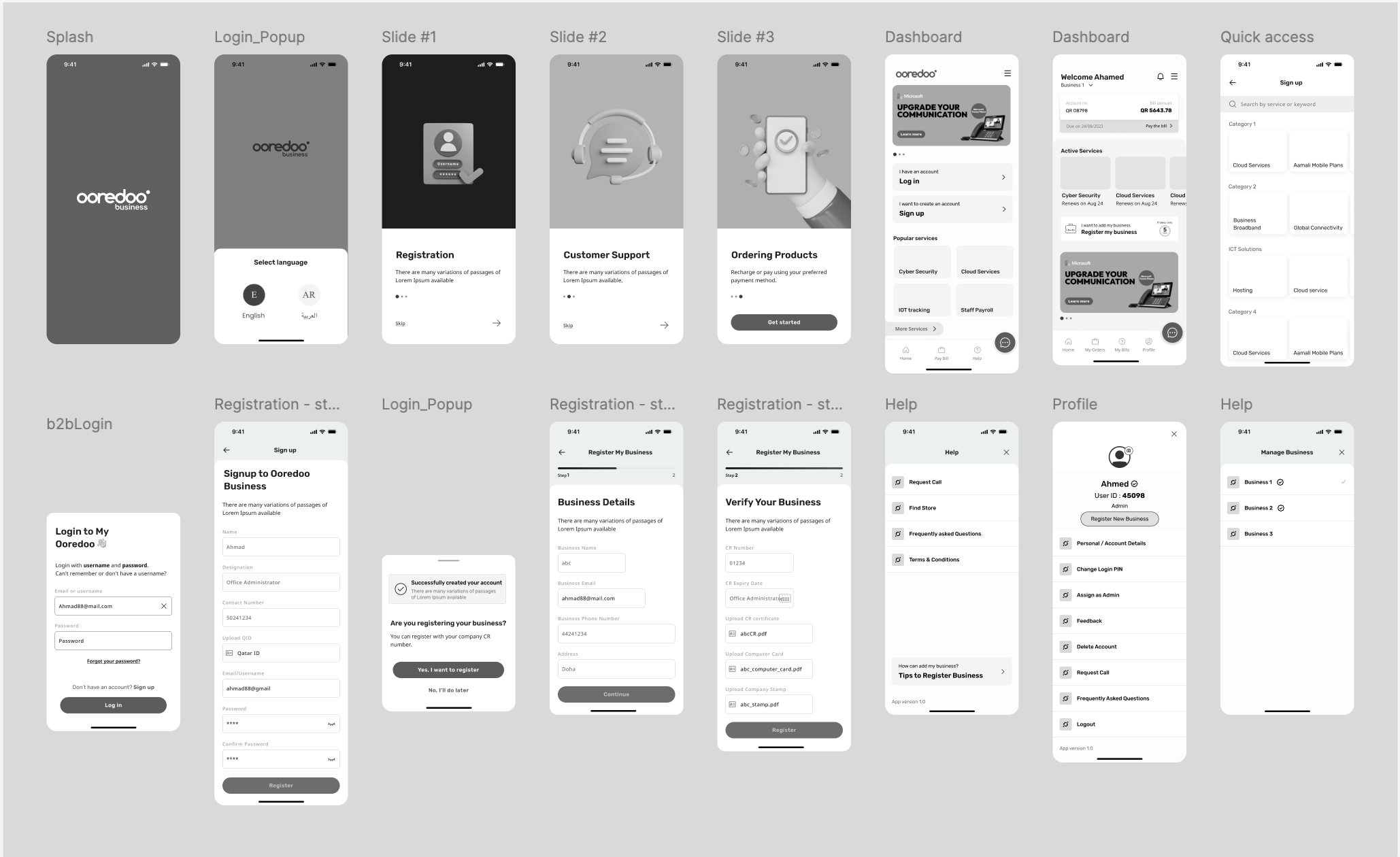
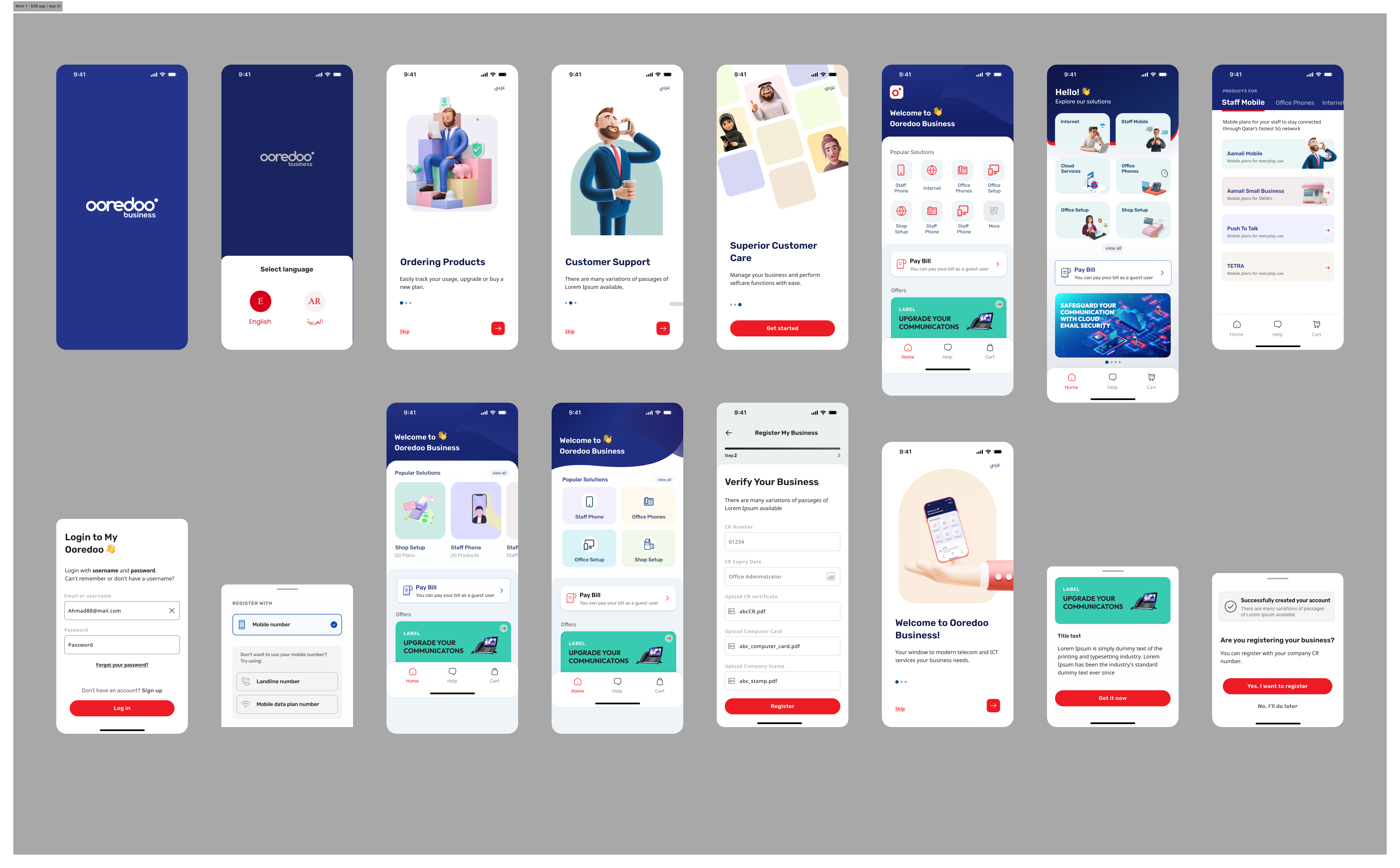
Key screens across the admin app

Drop PNG exports into assets/images/telecom/ to replace these placeholders.

Dashboard
Unified Admin Dashboard
Work queue, KPIs and customer-of-the-moment in a single view
Mobile
Mobile Admin
On-the-go view of operator queue and case detail
Detail
Business Customer Detail
Single unified profile from provisioning, billing and CRM
Flow
Key Flow — Service Provisioning
End-to-end flow for the highest-frequency operator task
Quick action
Quick Action — Mobile
Single-screen quick edit for common updates
05 — The Result

An admin app the
team actually opens first

Six legacy tools consolidated into one workspace — and the back-office team's day changed.

6 → 1
Tools Consolidated
Six legacy back-office tools collapsed into a single workspace.
~40%
Faster Case Handling
Average handling time for top operator tasks dropped ~40%.
1M+
Customers Served
Supports an operator team managing over a million accounts.
100%
Component Reuse
Every screen composes from the shared library.
Unified Customer View
Single business-customer profile pulling from provisioning, billing and CRM.
Faster Onboarding
New back-office staff become productive significantly faster.
Higher Throughput
Each operator handles more cases per shift without sacrificing accuracy.
Cleaner Handoff
Component-based design and tokenised specs gave engineering a reusable foundation.
06 — Reflection

What this project
taught me

Designing internal back-office tools is a very different craft from consumer apps. The user is captive, which makes it tempting to deprioritise polish. The opposite is true: every small friction compounds across hundreds of cases a day.

  • Shadow operators in real sessions — surveys and what people actually do are not the same.
  • Design for the most common 80% of cases first; the long tail belongs in a power-user view.
  • Build a component library early so the team can iterate on layout without re-inventing primitives.
  • Hand off with annotated edge cases — back-office software lives in the edge cases.
"

Our operators stopped opening five tabs to do one thing. That's the change."

Back-office Team Lead
Telecom Operator · Qatar
Skills demonstrated
User ResearchJob Shadowing Information ArchitectureWireframing IdeationPrototyping Usability TestingUI Design Component LibraryB2B Admin UX
Up Next

Webpage
Designs

A small collection of marketing and content pages — explore each in the lightbox gallery.