Home Work Device Pre-order
E-commerce UX Pre-order Flow Web 2024

Device Pre-order —
turning excitement
into a finished order

A focused pre-order flow for a high-anticipation device launch. The job was to convert hype into confirmed orders without scaring users off with friction, paperwork or hidden conditions.

My Role
UX/UI Designer
Scope
Pre-order landing + checkout flow
Platform
Responsive web (desktop-led)
Goal
High conversion, low support load
Constraints
Existing brand system · short launch window
Tools
Figma · FigJam
Hero
01 — The Challenge

Pre-orders are fragile

A device launch is an unusual e-commerce moment. Demand spikes for a few days. The product isn't shipping yet, so trust matters more than usual. The customer is excited but easily put off — by hidden fees, by a slow page, by an unfamiliar form, by anything that hints that the order might not actually go through.

The brief was to design a pre-order flow that respects that excitement: lead with the product, ask only what's necessary, make every decision visible, and confirm the order in a way that feels reassuring rather than transactional.

"The customer arrives in love with the product. Don't make them prove it twice."

02 — UX Rationale

Six decisions that did most of the work

The flow is built around six load-bearing decisions. Each one solves a different anxiety the customer brings into a pre-order — from "is this real" through "will it actually arrive" through "what am I agreeing to".

01
Entry gate — identify, don't interrogate
A single field — the mobile number — checks status and pre-fills the rest of the flow. Small first ask, no bounce.
Single-fieldPre-fill
02
Configurator — live total
Model, finish, capacity stacked vertically with the running total updating beside them. No flipping between configurator and price sheet.
Live totalPrice transparency
03
Form discipline — ask once
Minimum fields, every one justified. Inline validation catches errors before submit.
Minimal fieldsInline validation
04
Delivery — show the date
Actual dates and fees next to each option. Pickup is a peer choice, not a tax. The biggest launch-day support ticket — "when will it arrive?" — answered in-flow.
Date claritySupport deflection
05
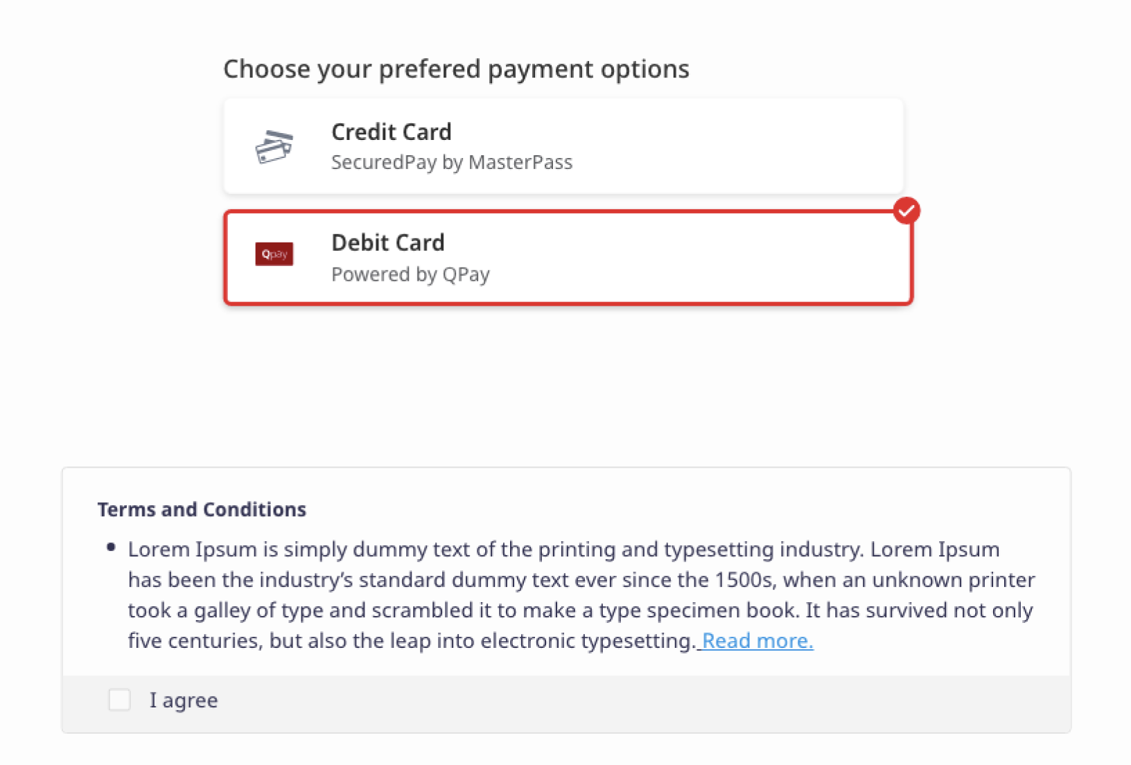
Payment — peer choices
Pay now, pay later, instalments — presented as equals with clear summaries. Financing surfaced at decision time, not hidden in a footer link.
Peer choicesFinancing visibility
06
Terms — plain & in-flow
Three short bullets at the moment of decision replace a wall of legal text. "I didn't realise" stops being the failure mode.
Plain languageIn-flow disclosure
03 — User Flow

Six steps from hype to confirmed order

The entire flow is six steps. Each step does one job, leaves the customer in a better-informed place, and never asks them to repeat themselves.

01
Entry — identify the customer
The customer arrives from a campaign and lands on a single-field gate that asks for the mobile number. A short note explains why it's needed.
Designed to: establish identity early so the rest of the flow can pre-fill, while keeping the first ask small enough that nobody bounces here.
Entry step
02
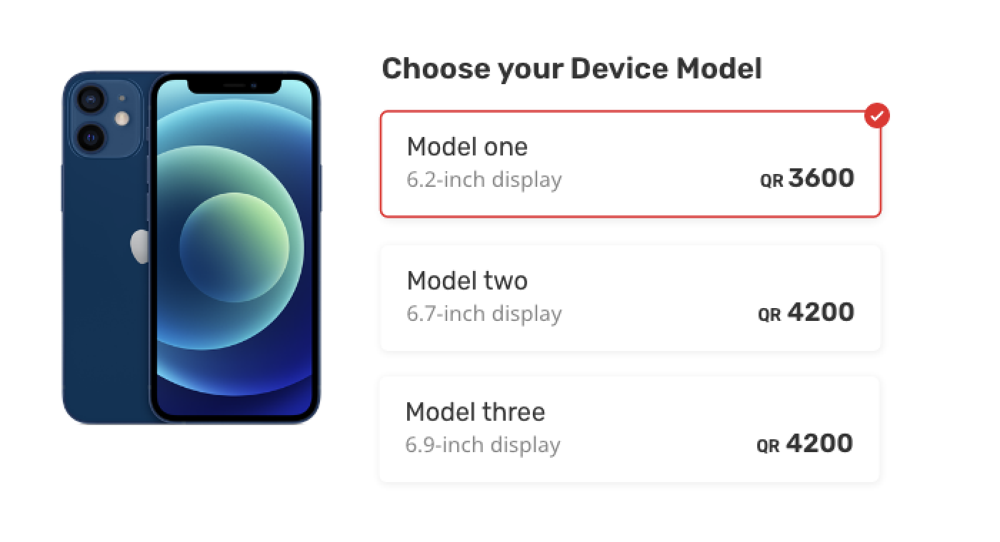
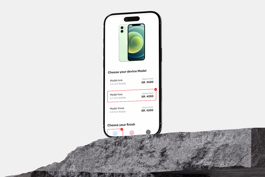
Choose the device — model first
The customer picks between the available models. Each option shows its starting price and the headline differences from the others.
Designed to: answer the first question every pre-order customer has — "which one is right for me?" — before getting into options that only matter once the model is fixed.
Choose model
03
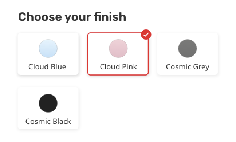
Choose the finish — visual decision
The finish is shown as colour swatches with the device preview updating in place. No price impact unless the finish is itself a paid upgrade.
Designed to: let the customer settle a purely visual decision in a visual way. The live preview removes the need to remember a colour name across the rest of the flow.
Choose finish
04
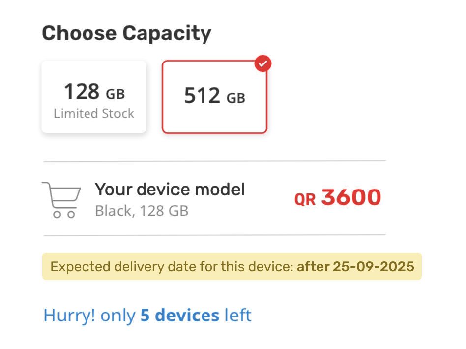
Choose the capacity — price-aware
Capacity options are shown with the delta in price next to each — not the absolute total — so the customer sees the cost of the upgrade explicitly.
Designed to: make a price-sensitive decision visible. Showing the upgrade cost rather than the cumulative total reframes the choice as "is X worth $Y more?" — which is what the customer is actually asking themselves.
Choose capacity
05
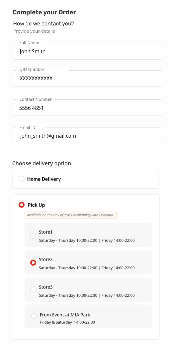
Contact & delivery — minimum viable form
Name, contact, address, delivery preference. Pre-filled where possible from the entry gate, validated inline, with delivery dates shown next to each option.
Designed to: minimise the section where drop-off is highest. Every field has a justification, every error appears where it happens, and the customer can see when the device will actually arrive before they choose.
Contact and delivery
06
Payment & confirm — peer choices, plain terms
Payment method is presented as peer options. Terms summary is shown inline as three short bullets. A single primary CTA completes the order.
Designed to: remove the most common reasons pre-orders fail at the last step — finance options not surfaced, terms hidden behind a link, or a confusing CTA. Everything the customer needs to decide is on this screen.
Payment and confirm
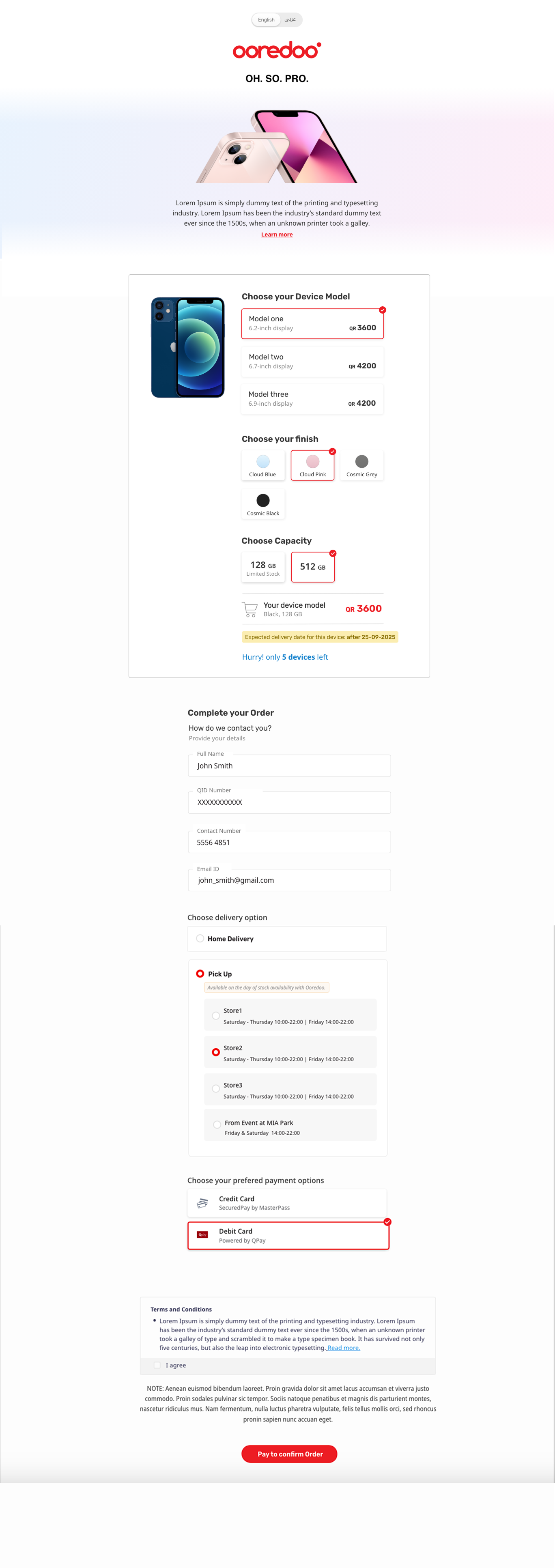
04 — Desktop Preview

The full page, in context

The complete pre-order page rendered inside a desktop browser frame. Hover anywhere on the preview and the page scrolls top-to-bottom so you can see the full layout.

preorder.example.com
Full pre-order page
Hover to scroll
Hover to scroll through the full page · pause by leaving the frame
05 — The Result

A pre-order that
doesn't leak orders

A flow that respects the launch-day excitement and converts it into confirmed orders without the usual checkout pain.

6
Steps Total
From landing to confirmation — each step does one job and leaves the customer better-informed.
1
Field at Entry
A single mobile-number gate that establishes identity and pre-fills downstream.
~50%
Fewer Form Fields
Compared with a typical carrier checkout, the redesigned form asks for roughly half as much.
Support Tickets
"When will it arrive?" and "what does pre-order mean?" answered in-flow.
Price & Date Transparency
Live total in the configurator, delivery dates visible at choice-time. The customer never has to guess what they're paying or when the device will arrive.
Minimum-Viable Form
Every field justified, every error inline. The form section is short enough that drop-off there stops being the dominant failure mode.
Financing Made Visible
Pay-later and instalment options surfaced as peer choices at the moment of decision — not as a footer link the customer has to discover.
Terms in Plain Language
Three short bullets at decision time replace a wall of legal text. Customers know what they're agreeing to, and post-order disputes drop.
Up Next

Online Booking
App & Landing

UI for a lifestyle booking app and its responsive marketing site — one shared system.