App Transformation —
screens with the
why behind them
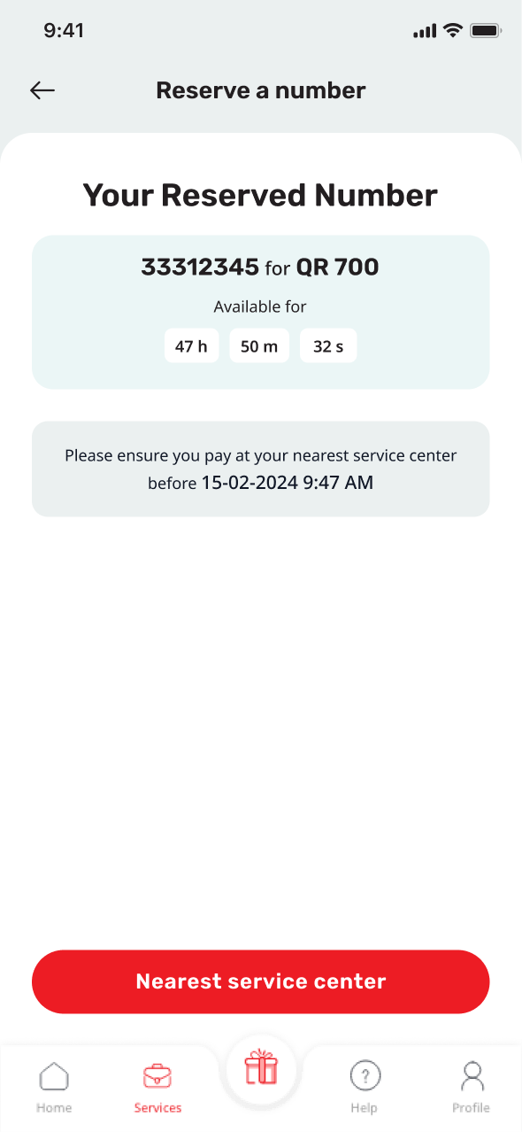
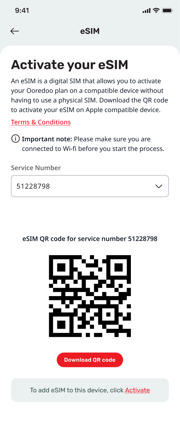
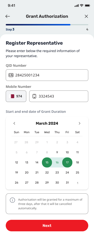
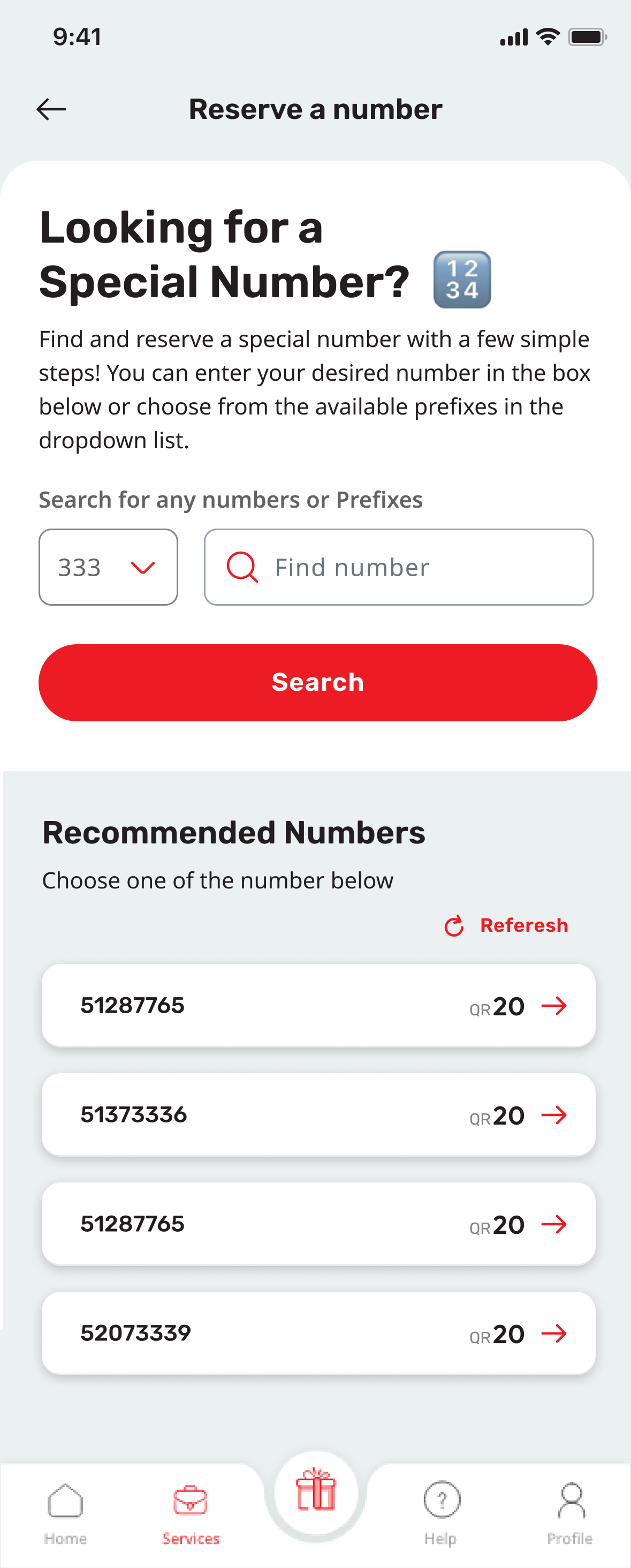
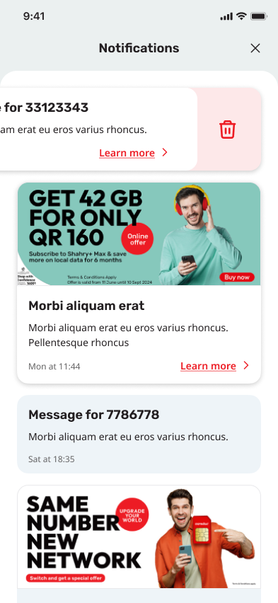
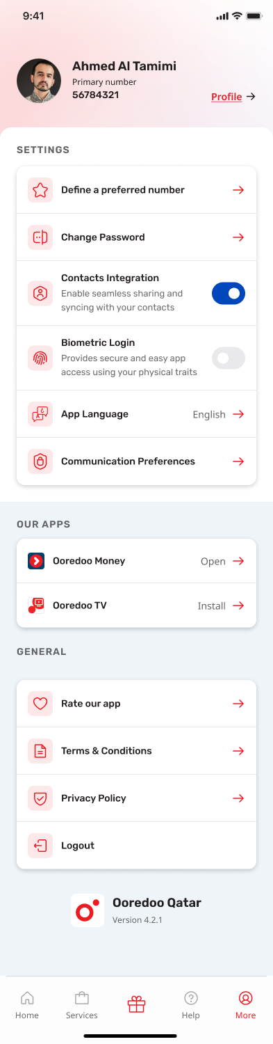
A selection of screens from a mobile-app transformation. Each one is shown alongside a short UX justification — the reasoning that drove the layout, the flow, and the small decisions that add up.
My Role
UX/UI Designer
Scope
Selected screens · before/after
Platform
iOS · Android
Focus
UX rationale per screen
Tools
Figma · FigJam